
Human interface
The design system, screens, and rules for the PWA.
The human surface is a calm mailroom for the operator's agents: quiet by default, one step louder when something waits, never alarming. This page records the design system behind it. The installable PWA shell, its screens, the Agents and access section under Settings, session detail, project deletion, opt-in inbox notifications, the confirmation dialog in front of a destructive action, the undo toast, the reply composer, and Project settings as its own screen ship. The Inbox ships its read state, its row swipes and its pull to refresh, and the desktop list plus detail layout ships for Sessions and the Inbox. The swipe gestures outside the Inbox and the toast are intended design, not yet shipped.
Tokens
A fixed token set carries both themes and both densities. It is reused verbatim, not reinterpreted.
- Themes. Warm paper in light, warm charcoal in dark, switched by a
data-themeattribute and following the operating system by default. A system that changes while the app is open changes the app with it, status bar included; a theme the reader chose follows nothing. - Surfaces. A canvas, a row and card surface, and an inset surface, with two line weights for dividers and control borders.
- Ink. A primary, a secondary at 6.3 to 1, and a meta tone at 5 to 1 on the surface.
- Accents. An accent for unread, links, focus, and selection; an action tone for waiting items and approvals; an ok tone for resolved and active; a danger tone reserved for prune confirmation.
- Event kinds. Each of the six families has a colour and a background partner, used only inside the glyph badge or as a two pixel accent, never as body text. An answer borrows the question tone: it is the reply on that thread, not a family of its own. A seventh pair, an olive, is the knowledge tone: it is drawn only by the Storage breakdown's knowledge segment and legend, so a byte count does not borrow the question tone, which means "an agent is asking you".
- Foundations. A focus ring, two shadows, three radii, a four step spacing scale, and a type scale from 12 to 28.
Fonts are system stacks: one humanist sans for interface text and monospace only for literal data such as identifiers and sizes. Nothing is fetched from a CDN.
The action tone is one step darker than the foundation draws it, because the foundation's value falls below the AA threshold on the inset surface and on its own background. The approval kind is that same value, so the button that asks for a decision and the badge that marks one are a single colour. No colour is written twice: the manifest, the shell, the icon, and the artifact frame all use values the token file declares, and the check fails on any that does not.
Type and glyphs
The scale runs 28 for a page title, 22 for a section, 17 for an item title, 15 for a row title and for body, 13 for meta, and 12 for an uppercase section label and for mono data. Titles hold a line height of at least 1.3 and body sits at 1.45. Where the foundation specifies 11px, the 12px floor wins.
Every event kind draws its own mark inside the badge: a dot for an update, a check for finished work, a question mark, an exclamation mark for an approval, a document for an artifact, a half disc for a session, and a reply arrow for an answer. The badge itself is hidden from assistive technology and the row carries a visually hidden word for the kind instead, once, so the kind survives both a reader who cannot separate the tints and a reader who hears the page.
Screens
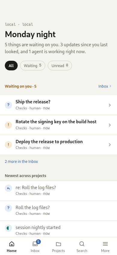
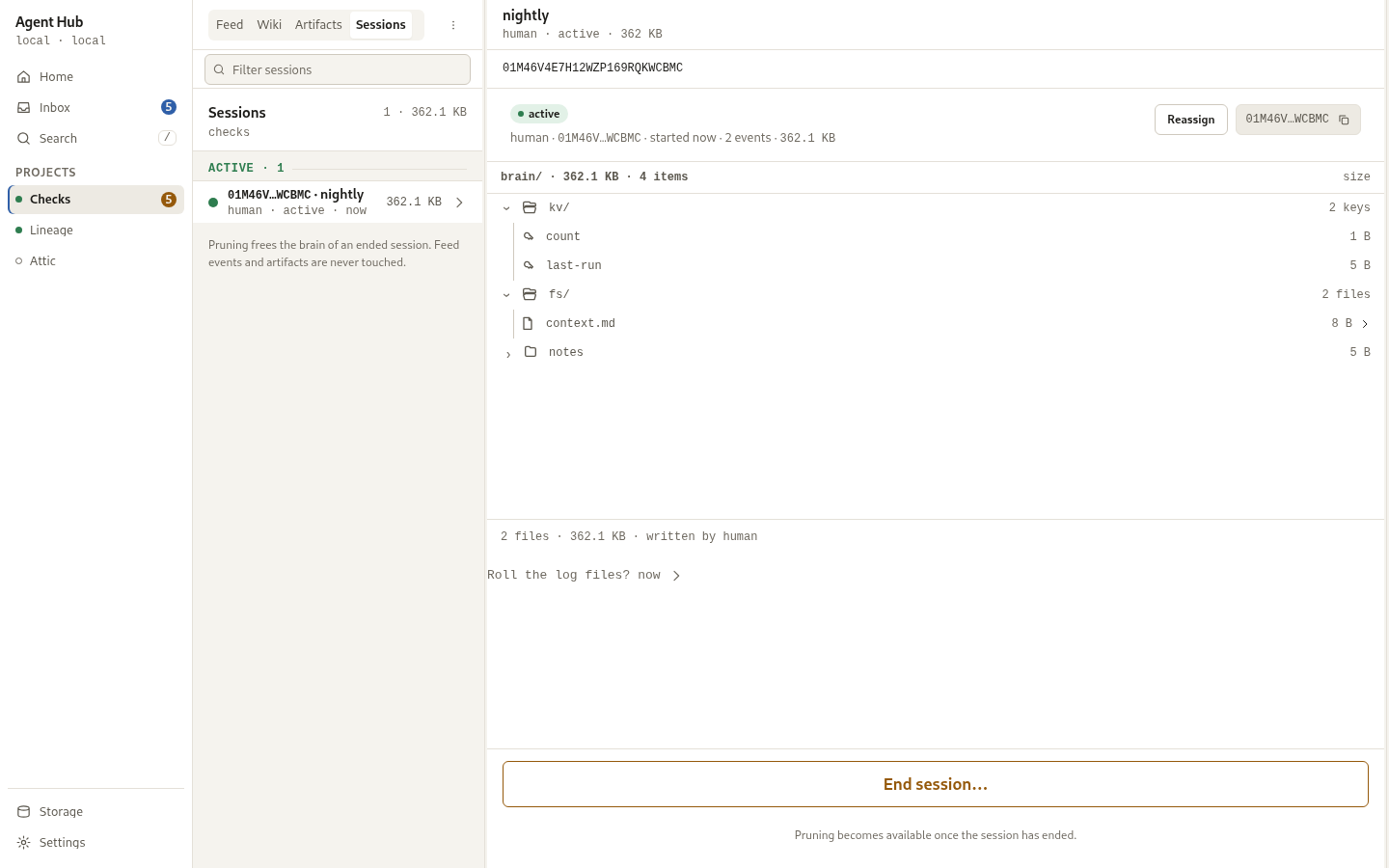
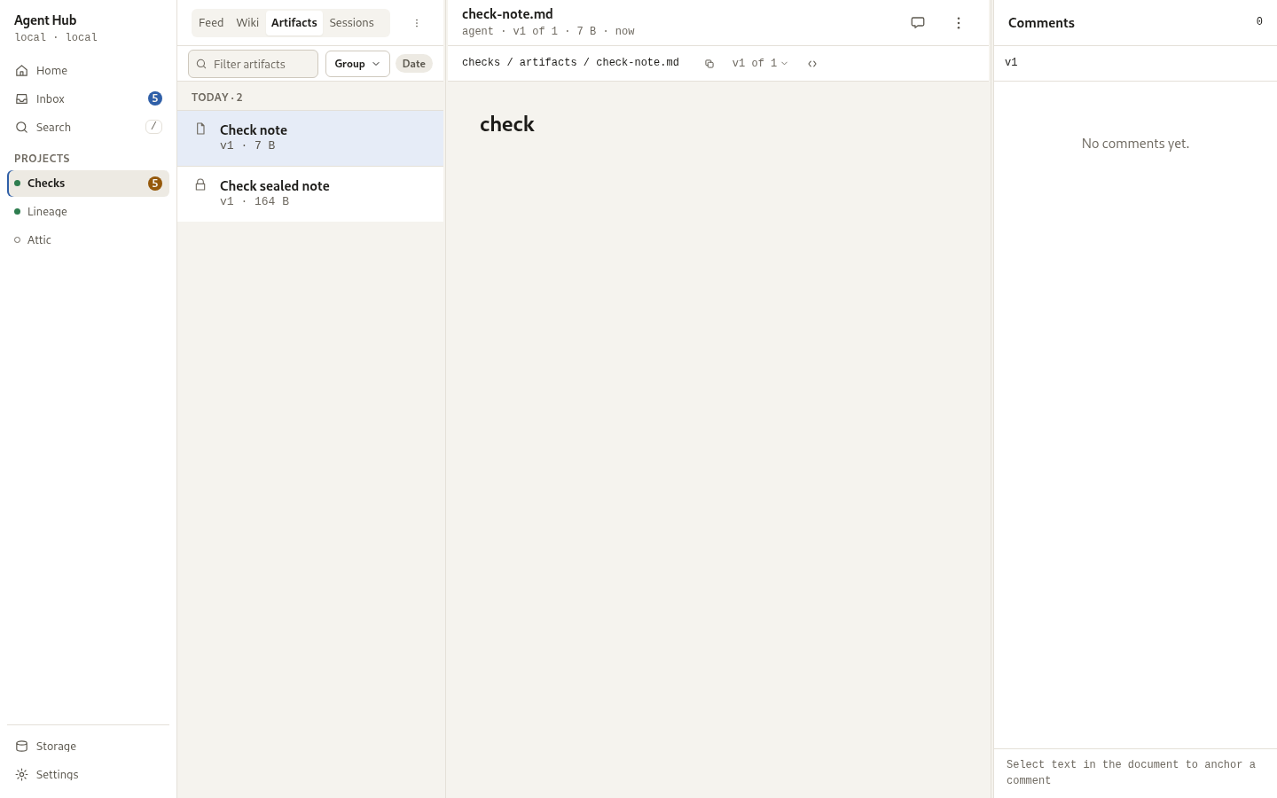
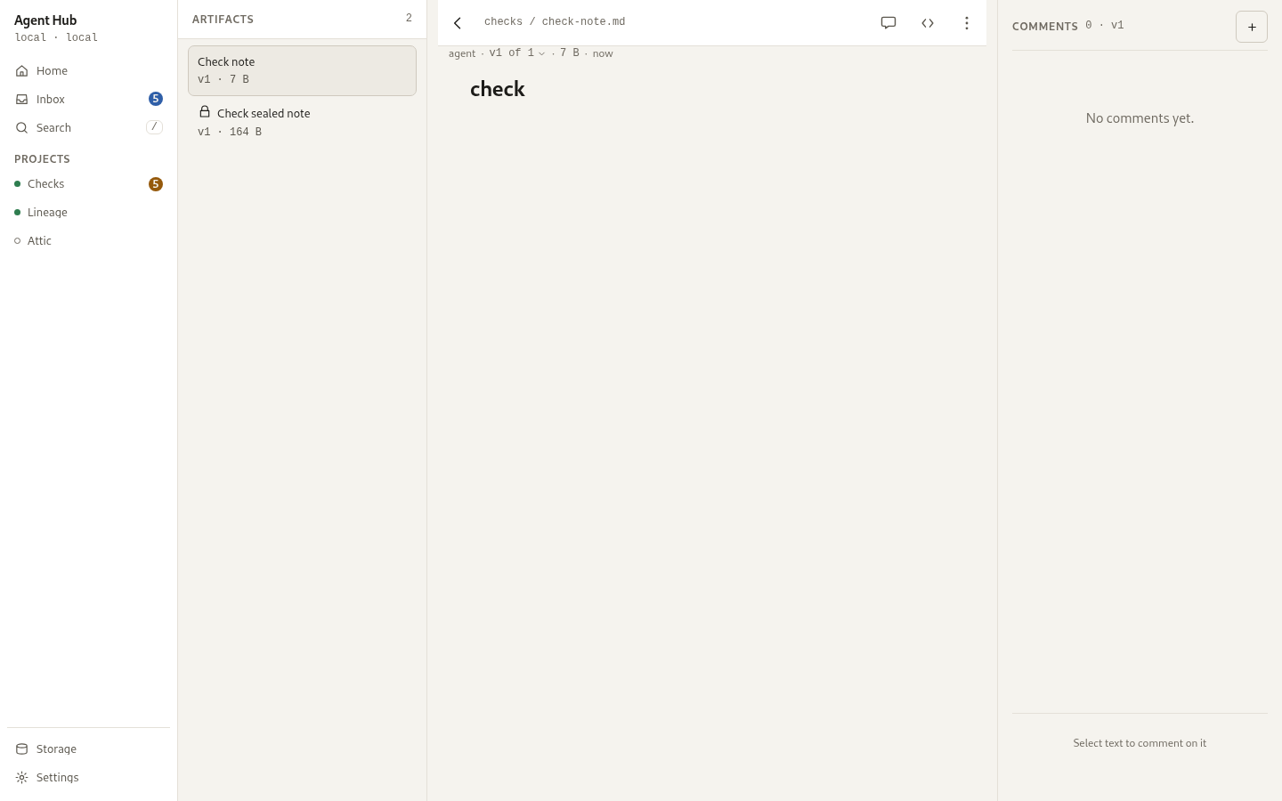
Eight screens: Home, Inbox, Project feed, Artifacts and viewer, Sessions and session, Search, Storage and prune, Project settings. Project settings holds the name, the read-only slug, the artifact password policy, the reserved retention card, Save and Delete project; agent and access management ships as a section of the global Settings screen rather than under Project settings. Mobile is primary with a five-tab bar of labelled icons (Home, Inbox, Projects, Search, More); desktop carries a permanent 200px app rail with Home, Inbox, Search, the project list, and Storage and Settings at its foot. The More tab root houses Storage, Agents and tokens, Settings, and the permanent sync line. Pushed screens from More retain More as the current tab and offer a back chevron in the 48px leading slot. A project is its own address: the feed, the artifact gallery and the sessions list sit under the project as segmented tabs, each with its own route, and each section is the same project view. The tabs sit in the index header and carry their counts; the index pane is 300px by default and draggable to 480, and below a 360px pane the counts drop and the tabs take 6px of padding rather than 10, so all four labels read in full at the default width. The artifact viewer is itself a route, so reload and the browser's Back keep the artifact on screen. A desktop list plus detail layout is a layout primitive screens opt into; Sessions is the first to use it, with a 420px list beside a detail pane.
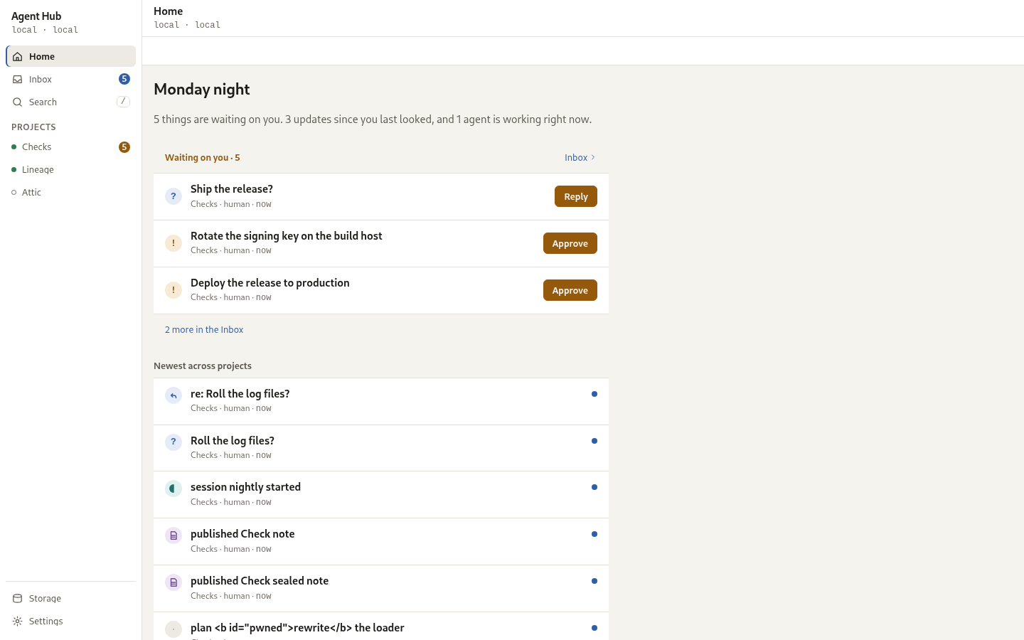
On a phone the frame is one collapsing header and one sticky 44px tools row: the header is 76px at rest (title 22/600 with meta line 5px below) and compresses to 52px when scrolled past 20px (title 15/600, meta hidden), over a 120ms ease-out transition (instant under reduced motion) with hysteresis at 20px and 8px. Under it, a sticky 44px tools row holds the screen's tools with no-wrap chips and buttons. Home is welcoming at rest: it carries no header bar, no gear, the greeting at 28px/600 at x 16 following the time of day, the status sentence in prose, flow chips, flat event rows, and the storage summary as the only card. Scrolled past the greeting, the standard 52px bar fades in with the title at x 48 and the chips pin under it in the 44px tools row. Settings carries no tools row and takes a bottom hairline.
The design contract the interface is being brought to, including the one
shell the sections converge on, lives in DESIGN.md at the repository root.
This page records what ships; that file records what is designed.
The screens
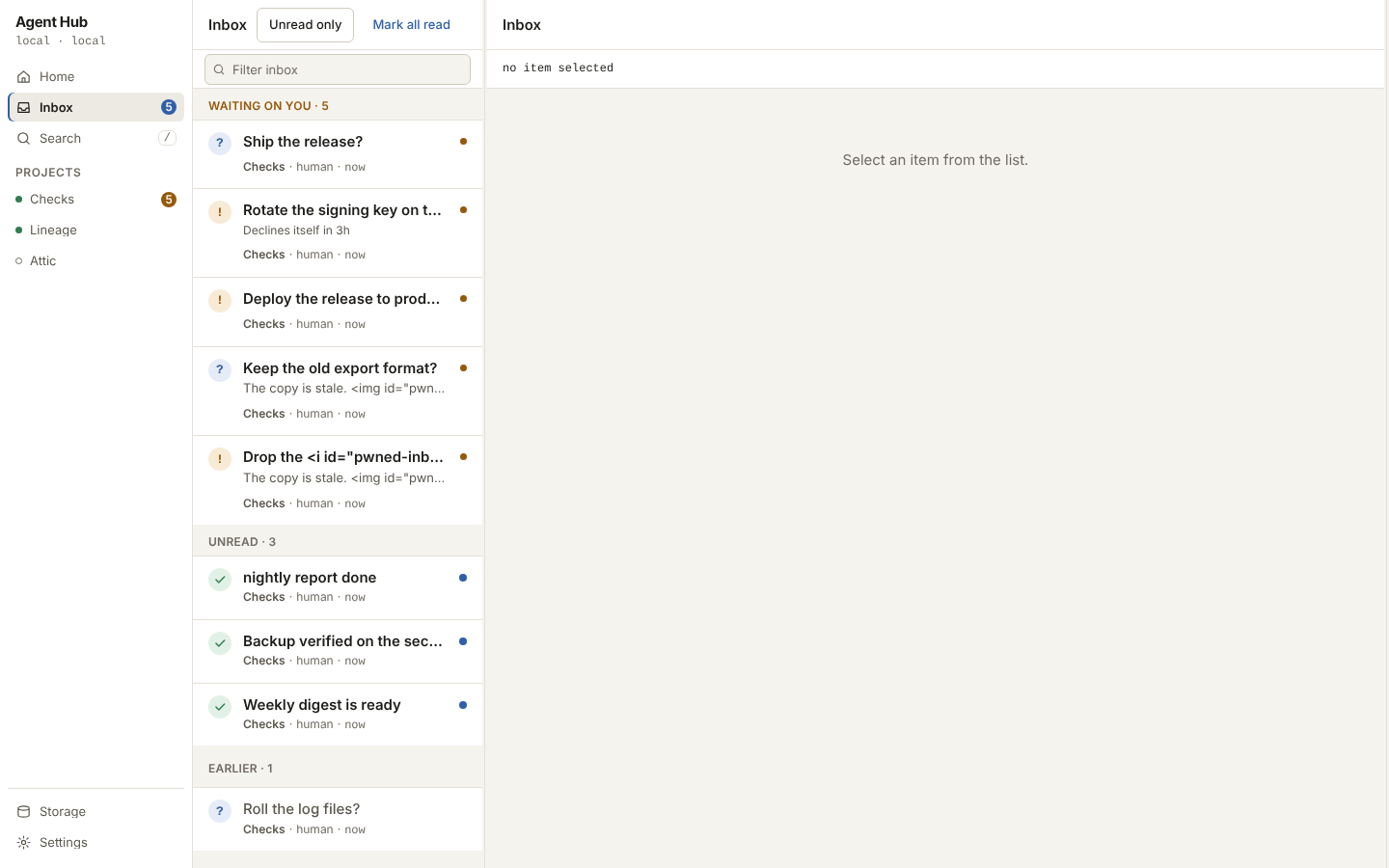
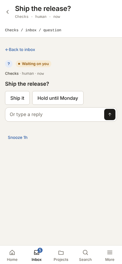
The figures below are captured from a seeded scratch hub at both widths and in both themes; they are the surface this page describes rather than a mockup.
Home, desktop and phone:
Inbox and an open item:
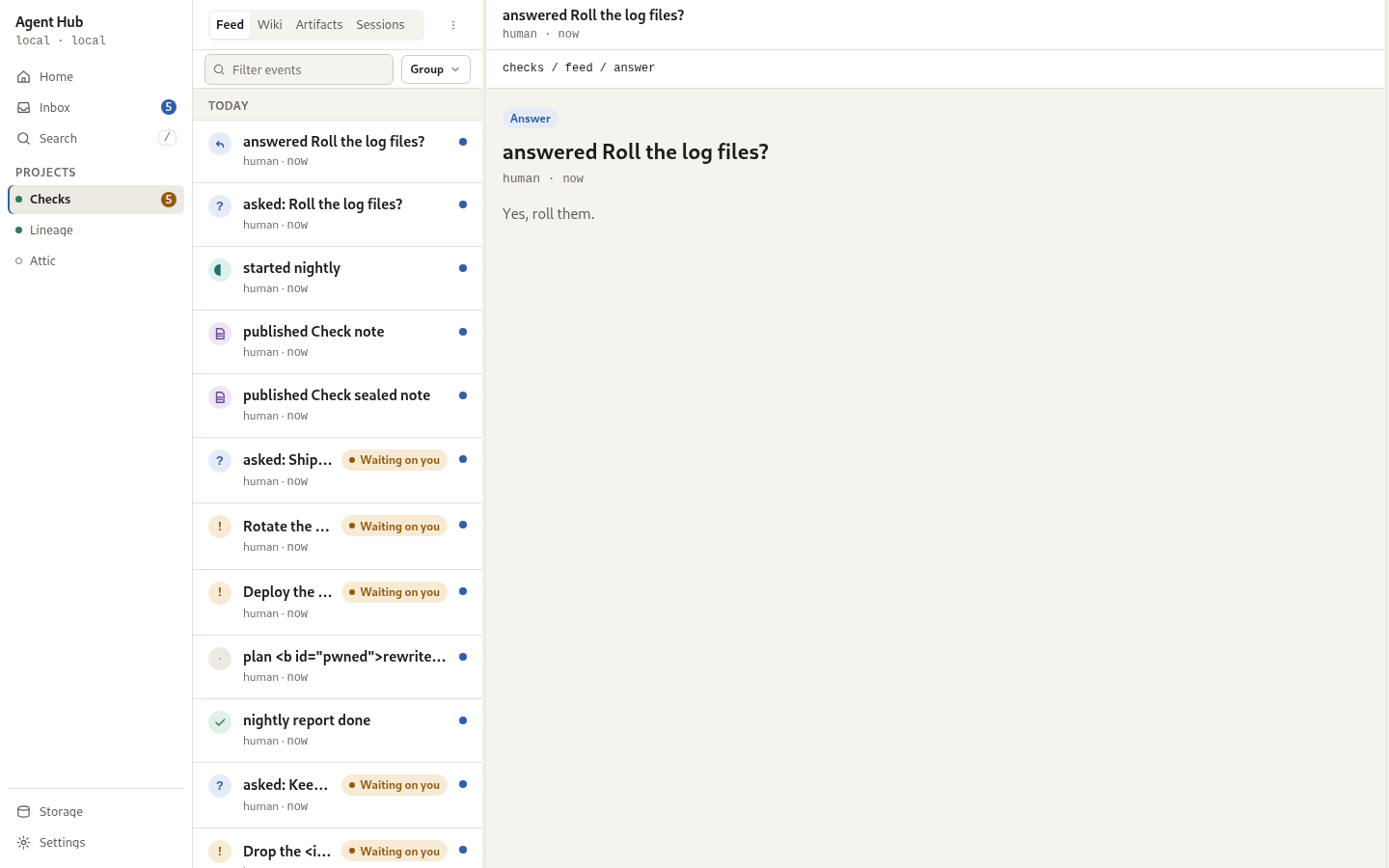
A project feed and its sessions:
Artifacts and the viewer:
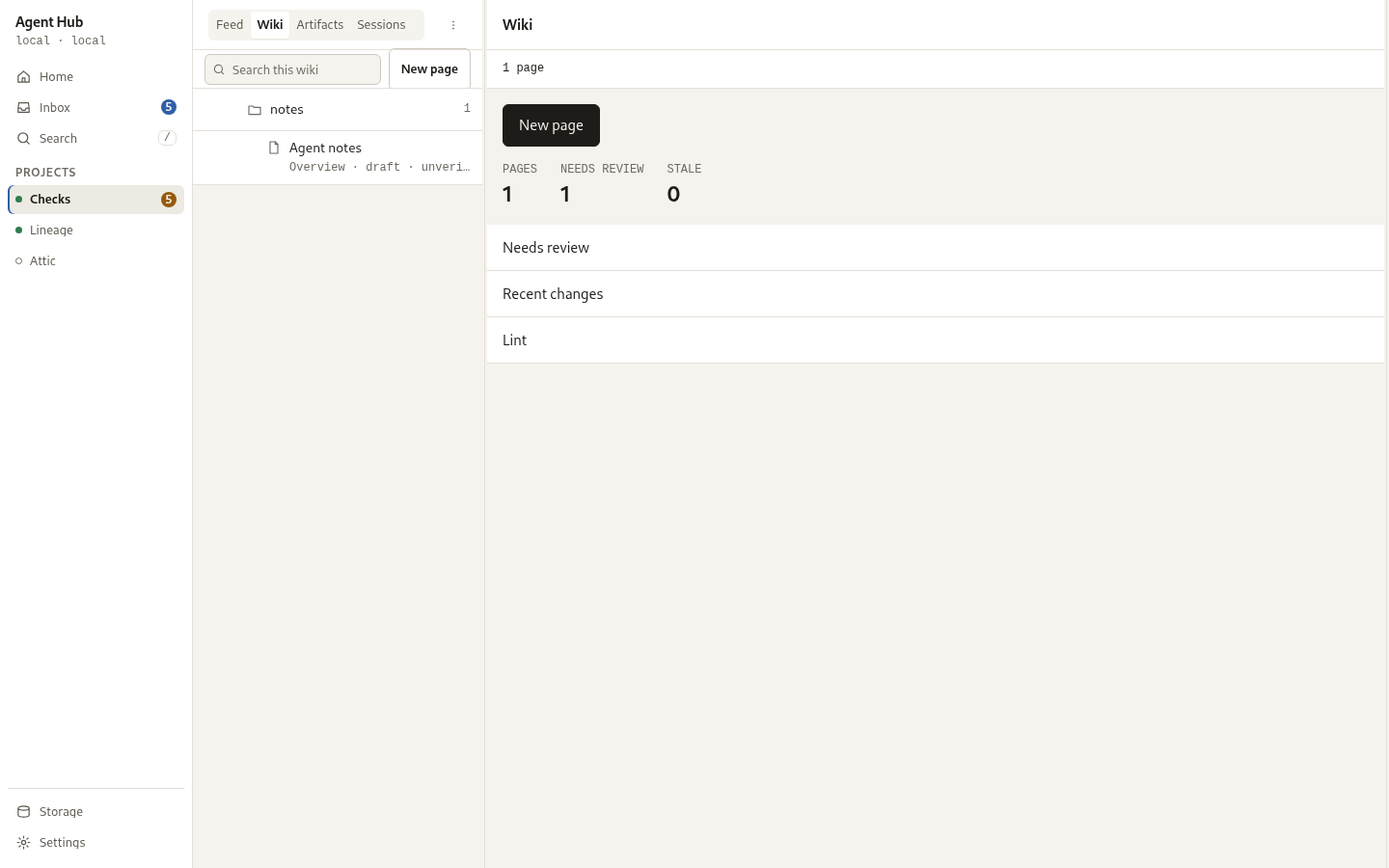
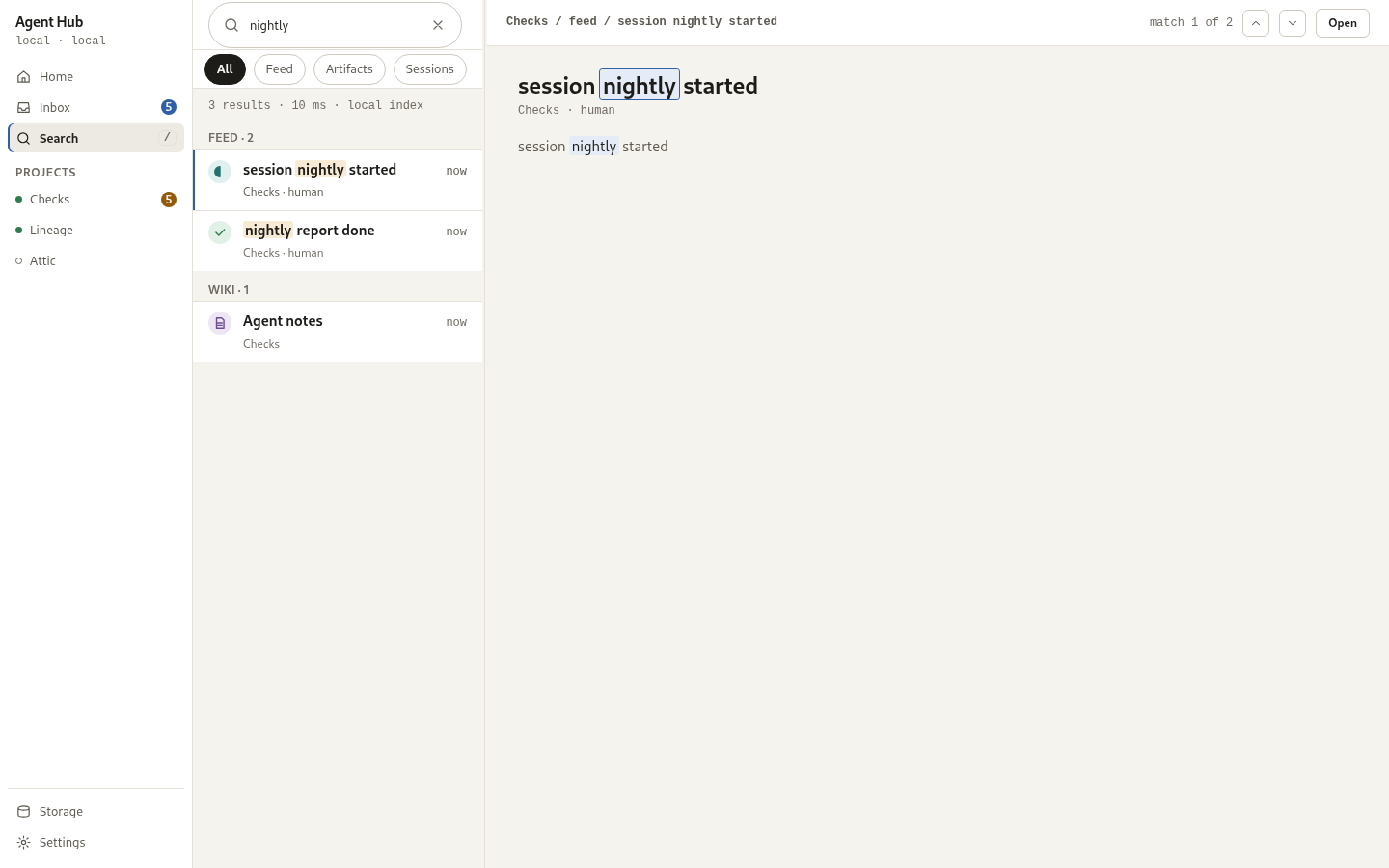
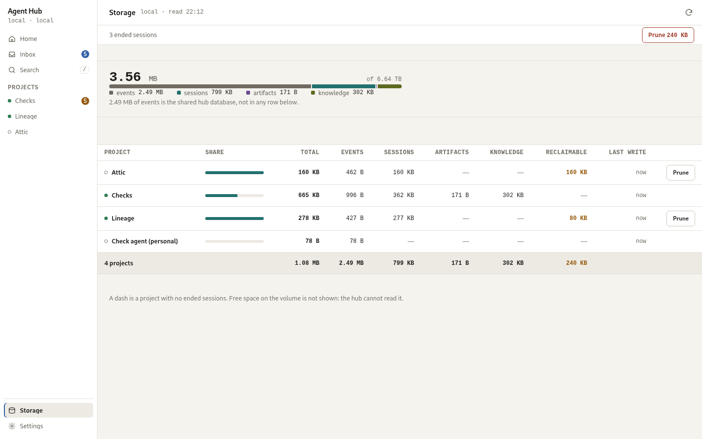
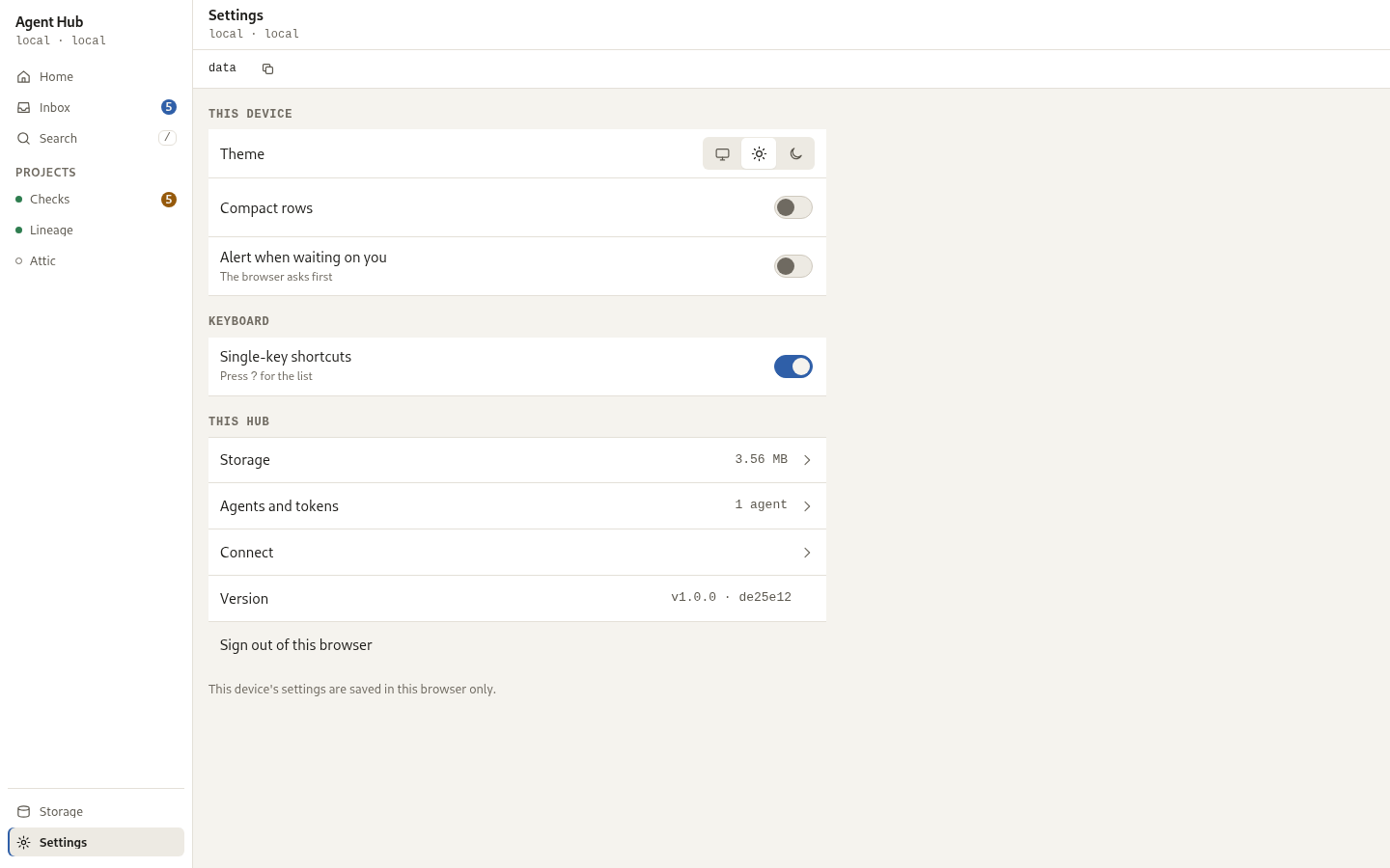
The knowledge base wiki, search, storage and settings:
The dark theme draws the same surfaces from the same tokens:
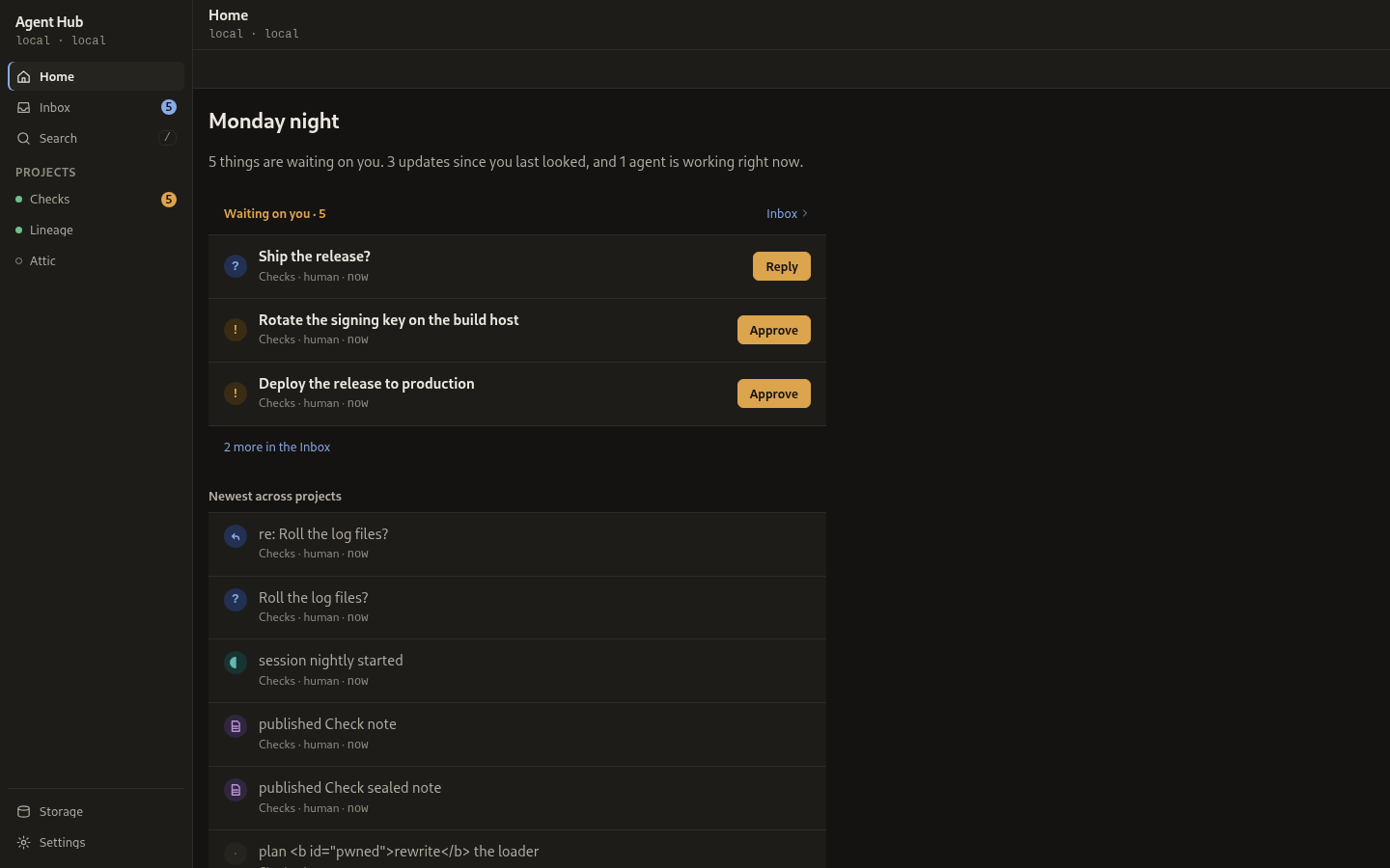
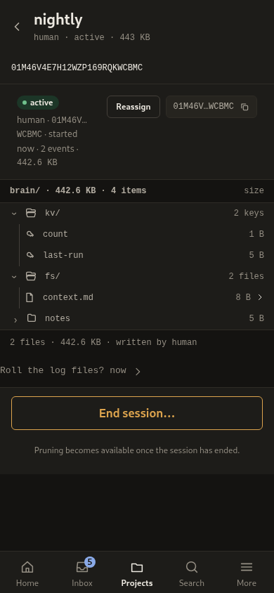
Round 12 splits the interface into content rules and chrome rules. The content rules, which say what a list, a summary, a settings row and a storage breakdown are, hold at both widths. The chrome rules, which are the collapsing phone header, the sticky 44px tools row, the tab bar and the More tab root, are phone-only. The desktop keeps its reserved 52px header and 40px control row in every pane, and this round gives it five changes: Home's lists are flat rows with the storage summary on the canvas between hairlines, Settings is a 640px column of 48px rows ending in a Version value row, Storage adds a fourth bar segment for knowledge and one helper line with zero cells drawn as a dash, Agents and tokens is a list-and-item screen with an index beside a stage, and the rail hides its sync line when the hub is healthy.
The project knowledge base
A project carries a fourth section, Wiki, beside Feed, Artifacts and
Sessions, and its tab names the page count. The tree is one meta=1 listing of
the whole knowledge base, drawn as a full tree from 768px up and one drill-in
level below that. Inside a directory the drill-in level carries a breadcrumb,
Wiki first and then each path part as a link; at the root it carries none, the
tools row above already names the section. A page row carries its title and a
mono line of its type, status and derived trust; a stale page adds the 12px
clock glyph and the word "stale"; a directory row carries its child count.
Selecting a page opens the reader in the stage: the frontmatter block is
metadata, drawn as the page's type, status and tags rather than as body text,
and the page's backlinks and comment threads are listed under it. A thread is
one level; an anchored
thread shows the quote, open threads are listed, and resolved threads fold under
a count at the foot. The reader offers Review, which stamps the bytes the
human read and carries the version they read; Edit opens the editor, whose
Save carries the version token the read carried. A page that changed under the
editor is refused rather than overwritten, and the refusal is said in place with
Reload theirs and Keep mine.
New page and Save to wiki are one sheet: a Location, a Title and a
Description, the file name computed from the title, and a note naming the type,
status and source. New page writes a page that is not there yet with
if_version: "absent"; Save to wiki, offered on a session brain entry, copies it
in through kb/promote and leaves the source where it was. The sheet is
reachable in the index header on the desktop and in the tools row and the Wiki
home on a phone, where the index control row is hidden.
The Wiki home carries the page, needs-review and stale counts and holds the
housekeeping screens: Recent changes (kb/history) reads who did what to
which page and when, grouped by day, with rows that are not tappable in this
version and an Earlier control that walks back a page of rows in place, and
Lint (kb/lint) lists the whole tree's findings with a Re-check that walks
it again. Needs review lists the pages the hub judges not human-reviewed,
and a row opens the page. The Home storage card carries one housekeeping line,
how many pages need review, from the storage report's own count. The routes and
refusals are in the project knowledge base.
First run
A fresh hub opens on Connect, where the token is checked against the hub before it is stored and the reader is returned to the route they were on. The Projects register is reachable from the rail's PROJECTS header on the desktop and from the tab bar on a phone, and a new hub's empty Home carries one call to action, create a project. Creating an agent issues its token once and reveals it; on a phone as well as a desktop the reveal offers the MCP setup for that agent with the token embedded, so the two halves are not spliced by hand. A pending enrolment reads in the inbox as "Pending enrolment" with the reason the agent gave, and the Access list marks a pending agent and shows its reason. A hub with no admin token configured says so on Connect and points at the startup fix, rather than repeating the refusal.
Interaction rules
- Every verb is reachable in two taps from Home: read, answer, approve, prune.
- Action items are inline in the Inbox as the first group, above unread, and grouped by actor within that group.
- Feeds are grouped by day, with kind filters as chips. A project feed keeps Today and Yesterday open and folds older days behind "Earlier", a disclosure with the count of what it holds. An event the reader has not seen carries a dot, a heavier title and the word for it, never the colour alone.
- Read is explicit, by opening an item, a swipe right, or the row's own Mark read control; never scroll-past. The Inbox header carries Mark all read and an Unread only filter, and marking one item read or unread offers an undo.
- Time is short on a row and whole on request. A row carries a compact relative form in the reader's own locale, counting itself up while the app is open; the full local timestamp is the element's accessible name and its hover title, and a press or a tap swaps it in for a reader who cannot hover. It is not a stop of its own: a screen holds one per row, and a list of them would be the whole tab ring. The row is the stop, and the full stamp is read with it.
- Search answers as you type, inside 50 ms of the last key, and keeps the
query in the address so Back and reload return to it. The field never
loses focus to its own results; the count is announced instead. A search
result row shows its title once, with matched words marked directly in the
title using an action-tinted mark (
<mark>on--action-bg,--ink, radius 3px, padding 0 2px), without a repeated snippet line beneath it. Results are flat rows rather than cards. On a phone, the search tools row holds horizontally scrollable scope chips (All n · Feed n · Artifacts n · Inbox n) whose text and counts never wrap across lines, and the count line stays in the header under the search field. The query is sent as typed, quotes and operators included, and the hub makes it safe for the index, so no query is refused. - Keyboard:
/focuses the list's own filter field when the screen has one, and otherwise search, which on the Search screen is its own field;jandkmove a selection through the rows of the current screen, Enter opens the selected row,aapproves andrreplies on it,ctoggles the comments aside where there is one, and Esc closes what is on top, the open inbox card included. The card also carries its own way out, "Back to inbox" on a phone and "Close" on the desktop, named by the words it shows. Either way the card's address is replaced, so Back does not reopen it, and focus returns to the row the card was opened from, or to the Earlier disclosure when that row is folded under it. Esc does not close a card that holds a half-written answer, whether focus is in the field or on the Send button beside it.?lists them and says where to switch them off. The selection is a real focus move, so the ring shows it and a reader following focus goes with it; a painted list parks the selection on its first row, so a reader who has never pressedjstill reaches the list by Tab. The selection follows focus: Tab or a pointer into a row's own control makes that row the selected one, andjandkgo on from there. Painting a list never takes focus. Nothing fires while the reader is typing, while a modifier is held, or while a dialog holds the keyboard. Because a key that needs no modifier fires on whatever reaches the keyboard, Settings carries a single-key shortcuts switch; turned off, no character key fires, and Esc and Tab are unaffected. - Prune is confirmed in a dialog, then reversible for a short window, then committed. The dialog holds focus inside itself, opens with the safe action focused, treats Esc as keeping, and hands focus back to the control that opened it.
- A question is answered in a composer under the item it belongs to, not in a browser prompt. A refused send keeps what was typed and says why in place.
- What an action did is reported in a toast, which is a live region so it is announced. A toast that carries an undo takes focus, because the undo is the only way back and the control that started the action has gone. One toast is on screen at a time and a new one replaces it.
- Swipes are first-class on mobile, never destructive, and always have a tap equivalent. The toast's swipe-down dismiss ships, with a dismiss control and Esc beside it. On an Inbox row a swipe right marks it read or unread and a swipe left uncovers the row's actions without deciding anything; both are also controls drawn on the row. Inbox rows are flat list rows without card wrapping, and an unread row carries both the accent dot and 600 title weight. On a phone, the inbox tools row holds the filter field (flex: 1, 34px pill) and an Unread chip, while the sync line lives on the More screen. A pull down at the top of the Inbox refreshes it, as does the Refresh control beside the last-synced line on More. The row follows the finger, and with reduced motion asked for it stays put and the release reveals. The edge swipe back, the tab swipe and swipes on feed rows are intended design, not yet shipped.
Alert hierarchy
Three levels, and no more. Quiet for read, ended, and signal items. Unread for a dot, weight, and a badge count. Waiting on you for an action pill and button, grouped at the top. Alerts are never red, never animated, and never a modal.
Accessibility
This is a build gate, not a guideline: WCAG AA in both themes, a 12px UI text floor, 44px tap targets, a visible focus ring, a full keyboard path, and no meaning carried by colour alone. Reduced motion is honoured.
The focus ring is the designed shadow over a transparent outline, because a browser in forced colours drops shadows and recolours outlines, and a ring that is only a shadow is no ring at all there. A text field is drawn one step darker than the design's hairline: an empty field has nothing inside it that says a control is there, so its border alone has to meet the 3:1 non-text minimum. An outline button keeps the hairline, because its own label identifies it.
The gate runs in three layers. A hermetic contract check computes WCAG contrast for every token pair on every surface it is painted on, enforces the 12px floor, holds the two typographic badge marks to the text threshold rather than the glyph one, and asserts the focus ring, the reduced-motion block, and the 44px interactive minimum, so it runs on every machine. A browser pass then measures what the page actually resolved: no text under 12px on any screen, every control at 44px or at the 32px inline size inside a row, a distinct mark per kind, and one kind word per row. An optional headless axe audit renders the eight screens in both themes and reports DOM, ARIA, label, heading, and computed-contrast problems. The last two need Playwright, a browser, and an axe build, and skip cleanly when they are absent.
Copy
Agent voice, past tense, no exclamation marks. Approvals name the action and its blast radius. Toasts state what happened and the reversible path. Empty states say what this is and what to do, in four parts: the screen's own name in mono, a title, one line, and at most one way to act, with no illustration. The copy for each screen lives in one table rather than inside eight screens; the screens adopt the component as each is reworked. There is no emoji anywhere; icons are inline SVG line glyphs or typographic marks.
See also
- Human surface - the API and screens
- Decision 0015 - the design foundation decision